머신러닝 성능 평가 지표
- confusion matrix 오차 행렬
- accuracy 정확도
- recall 재현률
- precision 정밀도
- f1 score
- roc auc
오차 행렬 confusion matrix
| True | False | |
| Positive | TP | FP |
| Negative | TN | TF |
- TP : 예측기 긍정, 실제 긍정
- FP : 예측기 긍정, 실제 부정
- TN : 예측기 부정, 실제 부정
- FN : 예측기 부정, 실제 긍정
=> 예측기것을 먼저 보고, T이면 예측기와 실제가 동일/F이면 실제값이 예측기와 다름
정확도 accuracy
- (TP + TN)/전체
- 예측기가 실제 긍정 부정을 찾을 비율
재현율 recall
- 예측기가 없마나 실제 긍정에서 참긍정을 잘 재현하는가?
- 참긍정/(참긍정 + 거짓부정 ) => TP/(TP + FN)
- 민감도 sensitify, TPR tru Postiive Rate라고도 함.
- 실제 참을 부정으로 판단 시 중요 지표. -> 양성 환자를 음성으로 판단시 위험
정밀도
- 참긍정/(참긍정 + 거짓긍정) => TP/(TP + FP)
- 예측기가 참을 얼마나 정밀하게 구하는가
- 부정 데이터를 긍정으로 잘못 예측 시 큰 영향을 받는 경우 중요 지표 -> 스팸 메일을 긍정으로 판단시 지장
Confusion_matrix, accuracy, recall, precision 보기
- sklearn.metrics 모듈에서 confusion_matrix, accuracy_score, recall_score, precision_score 제공
- 아래와 같이 전처리 한 경우에 대한 성능 평가 지표들
from sklearn.metrics import precision_recall_curve
from sklearn.metrics import accuracy_score, precision_score, recall_score, confusion_matrix
from sklearn.linear_model import LogisticRegression
from sklearn.model_selection import train_test_split
from sklearn.preprocessing import LabelEncoder
def get_categroy(age):
cat = ""
if age <= -1: cat = "Unknown"
elif age <= 5: cat = "Baby"
elif age <= 12: cat = "Child"
elif age <= 18: cat = "Teenager"
elif age <= 25: cat = "Student"
elif age <= 35: cat = "Young Adult"
elif age <= 60: cat = "Adult"
else : cat = "Elderly"
return cat
def feature_tf(df):
enc_feature = ["Sex", "AgeGroup"]
drop_feature = ["Name", "Embarked", "Ticket", "Cabin", "Age"]
df["AgeGroup"] = df["Age"].apply(lambda x : get_categroy(x))
df.drop(columns = drop_feature, inplace=True)
for feature in enc_feature:
enc = LabelEncoder()
df[feature] = enc.fit_transform(df[feature])
return df
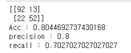
def show_metrics(y_test, y_pred):
confusion = confusion_matrix(y_test, y_pred)
accuracy = accuracy_score(y_test, y_pred)
precision = precision_score(y_test, y_pred)
recall = recall_score(y_test, y_pred)
print(confusion)
print("Acc : {}".format(accuracy))
print("precision : {}".format(precision))
print("recall : {}".format(recall))
df = pd.read_csv("res/titanic/train.csv")
X = df.iloc[:, df.columns != "Survived"]
y = df.iloc[:, df.columns == "Survived"]
feature_tf(X)
X_train, X_test, y_train, y_test = train_test_split(X, y, test_size=0.2)
lr = LogisticRegression()
lr.fit(X_train, y_train)
y_pred = lr.predict(X_test)
show_metrics(y_test, y_pred)
예측 레이블 확률 구하기 Estimator.predict_proba(X)
- 학습 완료된 추정기에 테스트 데이터를 주면, 해당 데이터에 대한 예측 확률 제공
- np.concatenate로 probability와 y_pred 값을 이은 결과는 아래와 같음
y_pred = lr.predict(X_test)
prob = lr.predict_proba(X_test)
res = np.concatenate([prob, y_pred.reshape(-1, 1)], axis=1)
res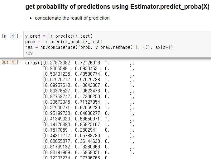
분류기 임계치에 따른 정밀도, 재현율 변화 Classifier.precision_recall_curve(y_true, prob_positive_pred)
- 실제 값과 긍정 예측 확률이 주어질때 임계치별 정밀도와 재현율의 변화를 보여줌
- 반환 값 : 정밀도, 재현율, 임계치
prob_positive_pred = lr.predict_proba(X_test)[:, 1]

precisions, recalls, thresholds = precision_recall_curve(y_test, prob_positive_pred)

print("th val : {}".format(thresholds[:4]))
print("precision val : {}".format(precisions[:4]))
print("recalls val : {}".format(recalls[:4]))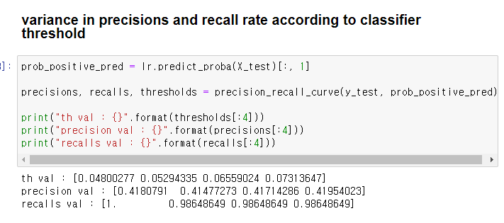
시각화하기
- 세 변수들 -> dict -> df -> seaborn으로 시각화
- 임계치 0.4부근에서 정밀도와 재현률의 교차점이 존재
df = {"thresholds":thresholds, "precisions":precisions[:-1], "recalls":recalls[:-1]}
df = pd.DataFrame.from_dict(df)
sns.lineplot(x="thresholds", y="precisions", data=df)
sns.lineplot(x="thresholds", y="recalls", data=df)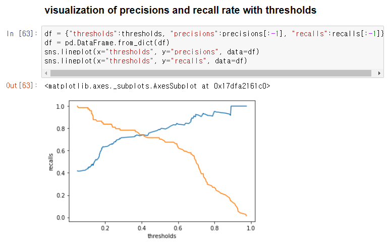
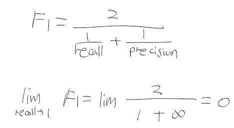
F1 Score
- 정밀도와 재현율을 결합하여 만들어진 지표.
- 둘중 하나에 치우쳐지지 않아야 높은 값을 가짐.
ROC Curve (Receiver Operation Characteristic Curve)
- 통신 장비 성능 평가를 위해 고안됨,
- X 축 : FPR(False Positive Rate), Y : TPR(True Positive Rate)
- TPR = TP/(TP + FN) 재현율, 민감도로 참 긍정/전체 참
- FPR : FP/(FP + TN) 거짓 긍정/전체 거짓
ROC Curve 모듈과 시각화
- from sklearn.metrics import roc_curve
- roc_curve(y_true, prob_pred_positive) -> FPR, TPR, thresholds
- 곡선은 1에 가까울수록 좋음.
from sklearn.metrics import roc_curve

fpr, tpr, thresholds = roc_curve(y_test,prob_positive_pred)

print("fpr val : {}".format(fpr[:4]))
print("tpr val : {}".format(tpr[:4]))
print("thresholds val : {}".format(thresholds[:4]))

df = {"threshold":thresholds, "fpr":fpr, "tpr":tpr}
df = pd.DataFrame.from_dict(df)
sns.lineplot(x="fpr", y="tpr", data=df)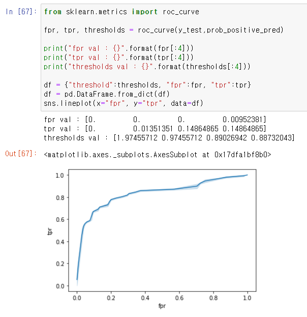
ROC AUC Score
- ROC 곡선의 AUC(Area under Curve).
- 곡선 아래의 넓이로 1에 가까울 수록 좋음.
from sklearn.metrics import roc_auc_score
roc_score = roc_auc_score(y_test, prob_positive_pred)
print(roc_score)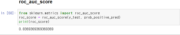
'인공지능' 카테고리의 다른 글
| 파이썬머신러닝 - 8. 결정 트리 (0) | 2020.11.25 |
|---|---|
| 파이썬머신러닝 - 7. 피마 인디언들의 당뇨병 여부 예측하기 (0) | 2020.11.24 |
| 파이썬머신러닝 - 5. 타이타닉 생존자 예측 (0) | 2020.11.23 |
| 파이썬머신러닝 - 4. 데이터 전처리 : 인코딩/피처 스케일링 (0) | 2020.11.23 |
| 파이썬머신러닝 - 3. 교차 검증/하이퍼 파라미터탐색 (0) | 2020.11.23 |